Download and subscribe on Apple Podcasts, Stitcher or TuneIn
Art Matters is the podcast that brings together popular culture and art history, hosted by Ferren Gipson.
Money. It's the little artwork you carry around in your wallet and probably never really look at. Can you remember who's on the back of the £5 note? Or the £10 note? The £20 note has a new resident, but we'll come to that later. Banknotes, as we think of them today, were first used in the 1600s when goldsmiths gave receipts for their customers' gold and silver deposits. A later version of this were the handwritten running cash notes the Bank of England began to issue from 1694. As these were receipts for deposits into the bank, cash notes would be for odd amounts of money – much more like a check than the banknotes we are accustomed to today. From 1743, the bank began to issue notes for fixed sums.
If you visit the Bank of England Museum, you can learn about the bank's vaults filled with 400,000 gold bars. These bars historically relate to a little phrase printed on each bill reading 'promise to pay the bearer on demand', which dates back to when people could exchange notes for their value in gold.
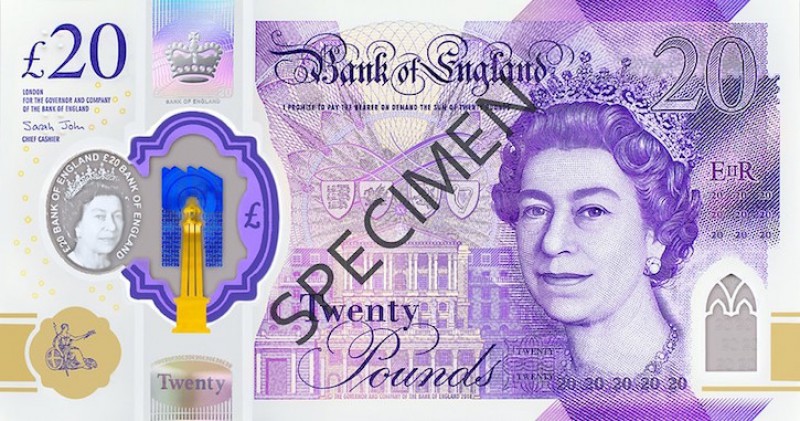
'One of my most important jobs is to make sure that people have high-quality banknotes that they can use with confidence,' says Sarah John, Chief Cashier of the Bank of England and the owner of the signature you see printed on every banknote. 'Notes haven't been linked to gold for a very long time, so the nature of that promise – the promise to pay the bearer on demand – has changed over time. When notes are withdrawn from circulation, if people find old notes in the back of cupboards, they can bring them in to us and we will always pay face value on those notes no matter how old they are.'
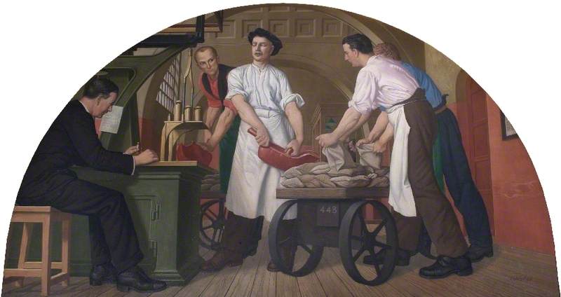
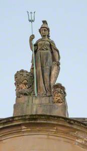
Britannia, Commerce, Justice and Other Carvings
1876
William Spence (c.1803?–1883) and James Charles Young (1839–1923) 
Banknote design
The look of the Bank of England's notes was originally black writing on a white piece of paper, and didn't change much until the 1920s. In 1928, the bank issued notes closer in appearance to what we're familiar with today, with colour and two printed sides. One common thread across centuries of banknotes is the appearance of the symbolic figure Britannia.
'In 1855, the artist Daniel Maclise was commissioned to redesign the Britannia vignette,' says Jenni Adam, Head Curator for the Bank of England Museum. 'His version of Britannia is shown looking straight ahead with her hair in a very severe parting – very Victorian, very much of the era.'
Production of new £20 notes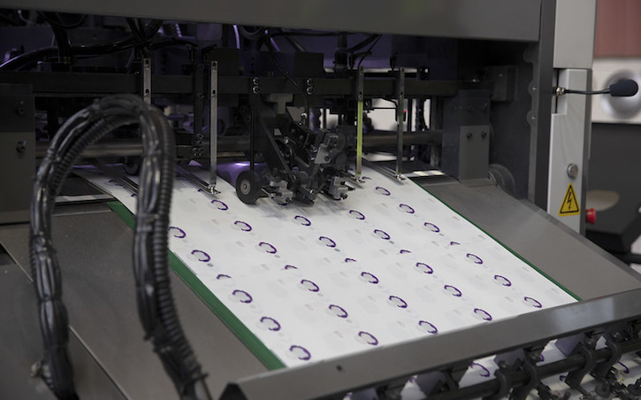
Technology and tastes have changed dramatically since the first notes were issued in 1694, and the bank now employs a combination of traditional and modern methods to make banknotes. Traditionally, notes were designed by hand and engravers would then make intaglio plates from these designs. The bank still uses plates as part of the printing process, but artists now do the illustration work on computers. Much of the back of the notes and the Bank of England on the front is printed by offset lithography. The queen's head and any other raised printed areas are printed by intaglio.
Bank of England's £5 note, 1952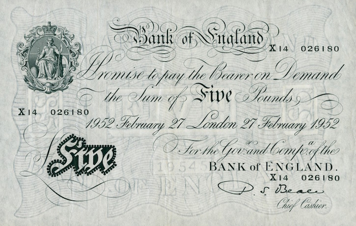
It was only a few weeks after the introduction of banknotes in 1694 that the first counterfeit notes started to appear. From this period onwards, counterfeiting concerns have factored into the banknote designs. The original designs had black writing on white paper but over time, different iterations of notes have included marbling, watermarks, metallic hairs, polymer windows and other tactical designs. The biggest changes in anti-counterfeit technology came after a close call during the Second World War, when the Nazis tried to take advantage of the simple £5 note design.
'They used prisoners of war to make counterfeit £5 notes,' says Sarah John. 'The plan was to airdrop the fake £5 notes onto the UK and flood the country with money and destabilise the economy. Luckily it never came to fruition and the notes were actually found after the war.'
Various notes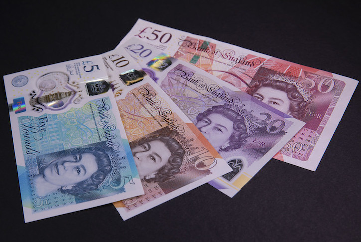
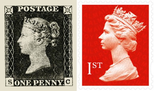
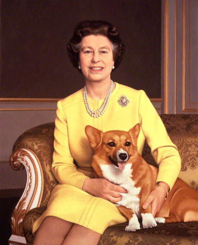
One counterfeiting measure was the introduction of portraits. The queen first appeared on a note in 1960 and historical characters appeared from the 1970s. There have been four portraits used for Elizabeth II on Bank of England notes, with the first design by illustrator Robert Austin for the £1 Series C note. The second was by Reynolds Stone, who also designed the coat of arms still found on British passports, and the third was by Harry Eccleston, the first in-house artist-designer for the Bank of England. The current portrait was designed by Roger Withington and is based on a photograph taken by Don Ford.
Historical figures were introduced to the backs of banknotes in 1970, with William Shakespeare serving as the first model on the £20 note. Later characters include Jane Austen, Charles Darwin, and Florence Nightingale amongst others. A new process allowing public nominations was introduced in 2014 to help decide which historical character to feature next.
The Turner £20 note
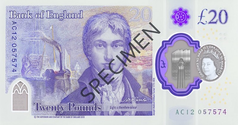
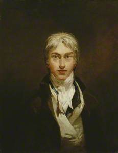
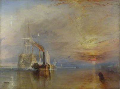
The new £20 design featuring J. M. W. Turner's portrait and an interpretation of The Fighting Temeraire was the first character to go through the new nomination process. A character advisory committee chose to celebrate the field of visual arts for the new design, and received over 29,000 nominations, with nearly 600 individual artists among that group. The shortlist included painter William Hogarth, sculptor Barbara Hepworth, film star Charlie Chaplin and designer Josiah Wedgwood.
'[Turner] exhibited at the Royal Academy at the age of just 15 and became an Academician at 24,' says Sarah. 'He produced 550 oil paintings, 2,000 watercolours [and] 30,000 drawings and sketches. So he really was incredibly prolific.'
The Fighting Temeraire tugged to her last berth to be broken up, 1838
1839
Joseph Mallord William Turner (1775–1851) 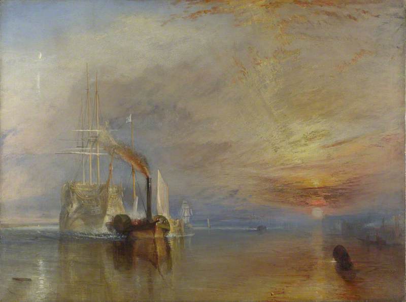
The work doesn't end once a character is selected. With such a breadth of artworks to choose from, the next task is for the design team to choose which artworks to feature. The team worked in collaboration with Tate Britain and The National Gallery to incorporate a self portrait and The Fighting Temeraire tugged to her Last Berth to be broken up, 1838, respectively.
'We can't reproduce the painting exactly as it is on a banknote,' says Debbie. 'We try to capture the essence of the oil painting in the engravings... We can't reproduce the amazing colours in the painting because we also have to try and portray the denomination colour of the banknote – for the £20 that's purple.'
Be sure to listen to the full episode in the player above or wherever you get your podcasts to find out about more easter eggs hidden in the new £20 note, the Bank of England art collection, and much more.
Listen to our other Art Matters podcast episodes
