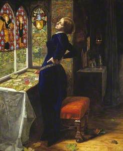
If you think of Victorian Britain, you might imagine scenes of smoggy, polluted cities, black-and-white photographs and sombre clothing. This distorted view of the Victorian age is partly down to the Victorians themselves with writers such as Charles Dickens defining the image of industrialisation with vast, filthy cities and appalling living conditions.
In fact, nothing could be further from the truth. This was one of the most colourful periods in British history. Thanks in part to a scientific discovery borne out of the Industrial Revolution, colours in all their rainbow hues were appreciated and used as never before by all sections of society.

In 1856, William Henry Perkin, a young student at London's Royal College of Chemistry, accidentally produced a vivid violet dye which he had isolated in the aniline molecule derived from coal tar. Thus, he succeeded in turning coal – the very stuff of the Industrial Revolution – into colour. This discovery was soon followed by a rainbow of new, coal tar-based aniline dyes, transforming the modern world and democratising colour. The invention of these new synthetic colours sparked a broader cultural commentary which affected colour perception as well as colour production.
John Ruskin, one of the most influential writers on art and architecture in nineteenth-century Britain, strove to restore colour back to its rightful importance in art. Since the Renaissance, colour had been considered by many as secondary to composition and design. Ruskin argued that colour was a divine gift from God and should be embraced just as it had been in medieval art. He believed the colours of the natural world could inspire and guide artists who should replicate them as truthfully as possible. He loved colour but hated anilines because of their industrial origin.
Study of a Kingfisher
1871, watercolour by John Ruskin (1819–1900) 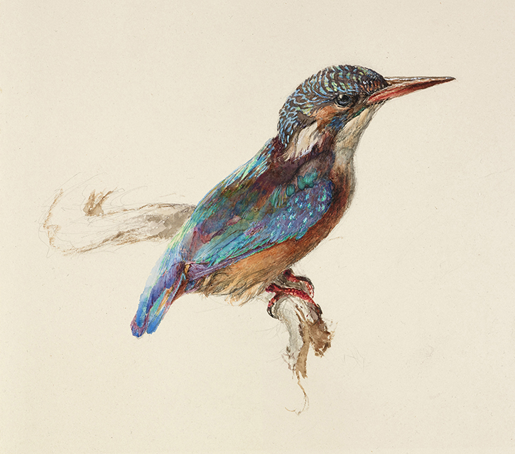
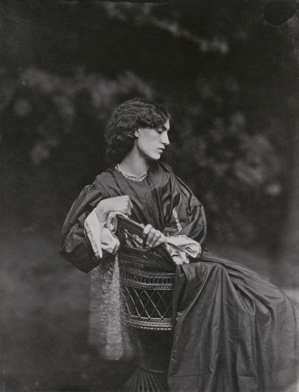
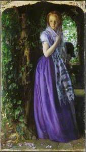
Similarly, William Morris supported the use of historical organic pigments over anilines. This explains why he could admire the beautiful purple of Arthur Hughes' April Love (he bought the painting in 1856) while loathing the newly invented mauve. The problem, simply, was not the hue but the material used to make the colour. Hughes' purple was not aniline, but a mixture of organic red madder and cobalt blue.

While Hughes' April Love was created with organic pigments, the painting also demonstrates the accessibility to colour that aniline dyes allowed. In 1856, when Hughes created the painting, the violet-blue dress worn would have been impossibly expensive for women like the miller's daughter in the painting. Just a few years later, however, the new dyes would make a purple dress affordable to every miller's daughter and shopgirl in the country.
From the 1870s, artists and writers who belonged to the 'Decadent' movement used colour in a way that divided the art world. Instead of Ruskin's 'sacred' or 'sanctifying' colours, the 'Aesthetes', as they called themselves, selected colours purely for their artistic or sensual effects. And certain colours, particularly green and yellow, carried connotations of subversion, decadence and decay.
Traditional green dyes had been notoriously unstable, but the new synthetic dyes could be used to dye clothes, wallpaper and – most unnaturally – the artificially coloured green carnations that Oscar Wilde made his hallmark. Seen by some as morally dubious, green also turned out to be physically toxic – a result of the arsenic often used to create it.
Decadent Young Woman, After the Dance (Jove decadent, despres del ball)
1899, oil on canvas by Ramon Casas (1866–1932) 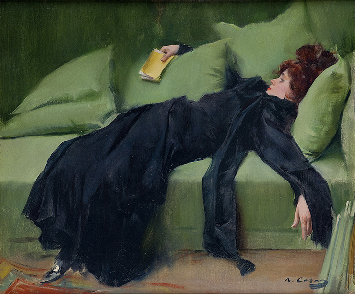
In Decadent Young Woman, After the Dance, Ramon Casas, a Catalan artist who trained in Paris, glamorised the decadent colour combination of green and yellow. The young woman is Madeleine Boisguillaume, who also modelled for Henri de Toulouse-Lautrec. Her chic black dress is not mourning wear but a sign of her refined style. She lies languidly on a green sofa with a book in her hand. Its yellow cover would have identified it as one of the risqué French novels that circulated on both sides of the Channel.

The mid-nineteenth century saw the publication of Charles Darwin's On the Origin of Species (1859) which drew public attention to the study of nature. Through Darwin's work, visual representations of plants and animals also became an important way of understanding the purpose of colour in the natural world. He argued that the colours of iridescent feathers and bright flowers only existed to encourage procreation. He also revealed that males were far more likely to display colour – to the great shock of soberly dressed Victorian men.
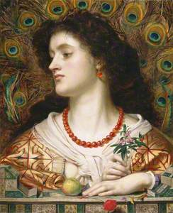
By this definition, women's colourful clothes could be seen as tools of seduction. Particularly potent was the gorgeous, iridescent peacock feather. This led to artistic representations of women with peacock feathers which portrayed women as seductresses.
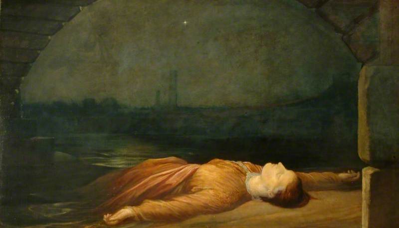
In Frederick Sandys' painting Vivien, the title character depicted, also known as the Lady of the Lake, was a sorceress from the legends of King Arthur. She is surrounded by objects that imply her power is derived from nature. A striking fan of peacock feathers frames her face to signify vanity. Sandys uses them to highlight her role as a sexual enticer appropriating the colourful plumage of the male.

The conflict between the colours of the past and the coal tar-based hues of modernity strikingly converged at the 1862 International Exhibition. The exhibition was an emblem of the new chromatic age and filled with kaleidoscopic experiences that delighted the show's six million visitors. It brought together examples of British, colonial and international products under one roof in South Kensington, in a building designed according to the latest research into colour theory.
The show received unprecedented international media coverage in colour thanks to the new technique of chromolithography. This technique was not the first colour printing process, but it was the first to use aniline inks and enable polychrome printing on an industrial scale. It enabled printing to become much cheaper and therefore more widely used in all aspects of print, from books and calendars to greetings cards and food packaging.
Through this complex, multifaceted history of nineteenth-century colour and its impact, we can retell the story of an often-misunderstood era. It was not one weighed down by a bleak, oppressive monochrome palette, but instead a period that was the beginning of a world filled with technicolour experiences. It was a colourful world that would eventually become the one we recognise today.
To see these artworks and discover more, visit the Ashmolean Museum's current major exhibition, 'Colour Revolution: Victorian Art, Fashion & Design', open until 18th February 2024.
Matthew Winterbottom, Assistant Keeper, Curator of Decorative Arts and Sculpture for the Ashmolean Museum and Curator of 'Colour Revolution...', Madeline Hewitson, Research Assistant for 'Colour Revolution...' and Chromotope research project and Natasha Podro, Interpretation & Digital Content Producer for the Ashmolean Museum