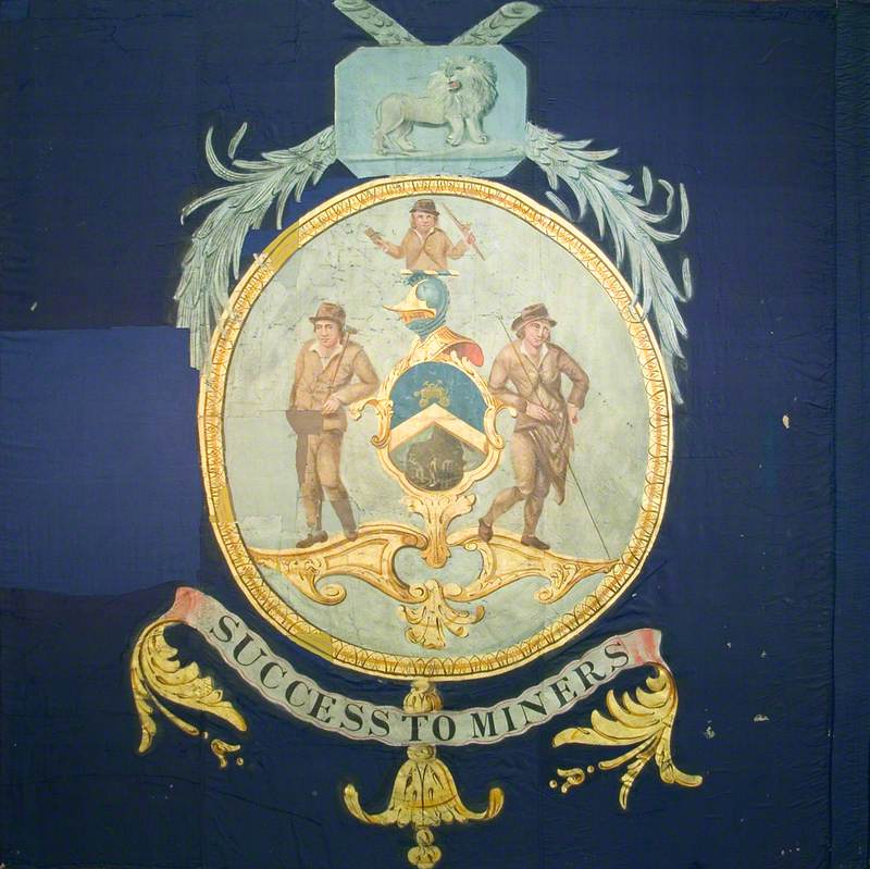
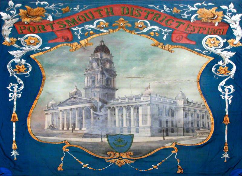
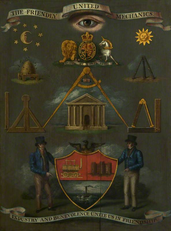
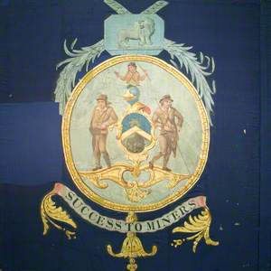
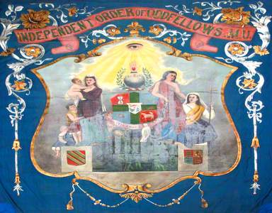
From the smoggy days of the industrial revolution until the middle of the previous century, it was customary for trade unions to commission elaborate banners for display at marches and celebrations. Union banners often collaged a diverse spectrum of visual references, from medieval guilds to freemasonry, and biblical stories to Greek mythology.
Against the backdrop of immense social change that saw Britain's working classes stripped of their agency, these banners constitute a rare example of art produced by and for the masses.
The industrial revolution swept Britain's rural workers into the cities, destroying long-established community structures in its wake. In this new and unstable society, people looked for new ways to band together against poverty and isolation.
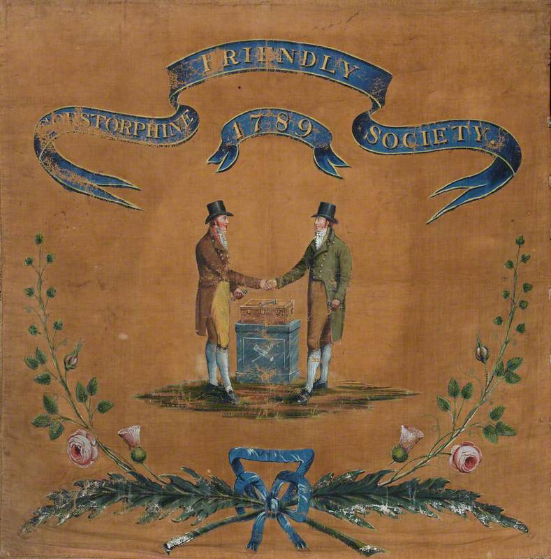
The British government, nervously eyeballing the French Revolution, outlawed trade clubs with the Combination Acts of 1799 and 1800. The loophole was that freemasonry remained legal – as did 'friendly societies.'
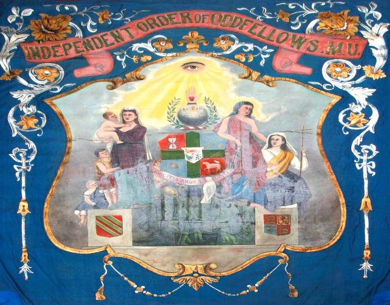
Friendly societies were part-social clubs, part-insurance schemes. Members paid into a communal fund and received cash if they fell ill or died, to cover funeral costs. Many friendly societies adopted the infrastructure of freemasonry, with initiation tasks and secret passwords.
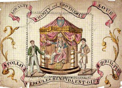
The visual precedent for trade union banners can be seen in the below design for the Order of Independent Oddfellows, one of the UK's largest friendly societies. In the centre, the society's essential function plays out. A man with a broken arm brandishes his medical bill on the left, and on the right, a brother flushed with health pays into a mutual aid fund.
Members of a Friendly Society Compensating One of Its Members for Ill Health
c.1807
unknown artist 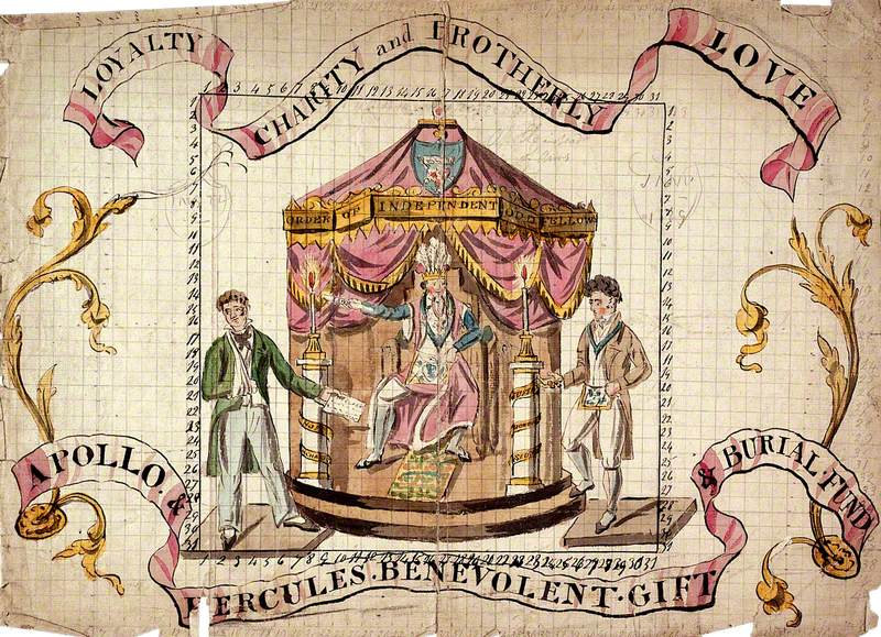
The cloaked and feathered man in the centre of the image is likely wearing the ceremonial garb of this branch of the society. Such costumes were common practice – the Nottingham Imperial Oddfellows, for instance, held their meetings in full-length medieval garb.
The pomp and ceremony served a purpose. To attract new recruits, societies had to project an image of affluence; young would-be members needed assurance that a friendly society would stay solvent long enough to pay for their funeral rites. Societies with too many older members sometimes went bankrupt from payouts.
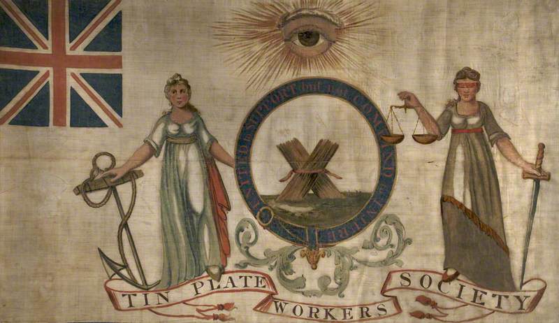
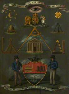
In terms of trade unions proper, the Tin-Plate Workers' banner by William Dixon is the earliest known example. It was created in 1821, three years before the Combination Acts were repealed, effectively legalising trade unionism. Before it, unions were underground organisations. Sometimes literally – the Iron Founders, for instance, met at night on the moors and kept their records buried in the earth.
Several details of this banner evoke clandestine traditions: the all-seeing eye of God at the top of the banner is a symbol of freemasonry, as are the bundles of sticks in the centre. Known as 'fasces', these bundles are a pre-Roman symbol of strength through unity.
Other aspects of this banner, however, clamour for the union's respectability to be recognised. The Union Jack flag in the top-right corner stresses patriotic intentions, and the allegorical figures are a pastiche of the academic art of the ruling classes.
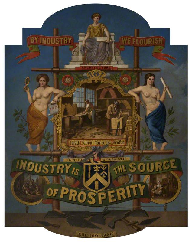
Even forty years after the repeal of the Combination Acts, union banner imagery continued to appeal for establishment acceptance. Take, for instance, the below emblem for the Operative Bricklayers Society which was likely intended to be turned into a banner as well as a printed certificate.
At its centre, we peer into an idealised scene of bricklayers at work, showcasing the member's contribution to society. The coat of arms connects the group to medieval guilds – bodies which were thought to prefigure the hardworking, entrepreneurial values of Victorian England's respectable classes.
There are also ennobling references to Greek and Roman mythology in the allegorical figures of Truth with her mirror, Science with her compass and, enthroned on the top, Architecture, who watches over the diligent bricklayers from on high. Tudor roses are nestled in the decorative wooden frame, confirming the group's centuries-old lineage and allegiance to the crown.
Whilst these symbols portray a conciliatory attitude towards the social order, the banner's monumentality also asserts power. With its overwhelming detail, it would have appeared almost outrageously showy on a parade. This quality was not uncommon – some union banners were so large that they had to be wheeled along on specially designed mounts. These banners were a visual argument to would-be members that the union had the resources to protect them.
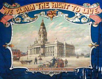
'United We Stand, Divided We Fall'
1896
George Tutill (1817–1887) 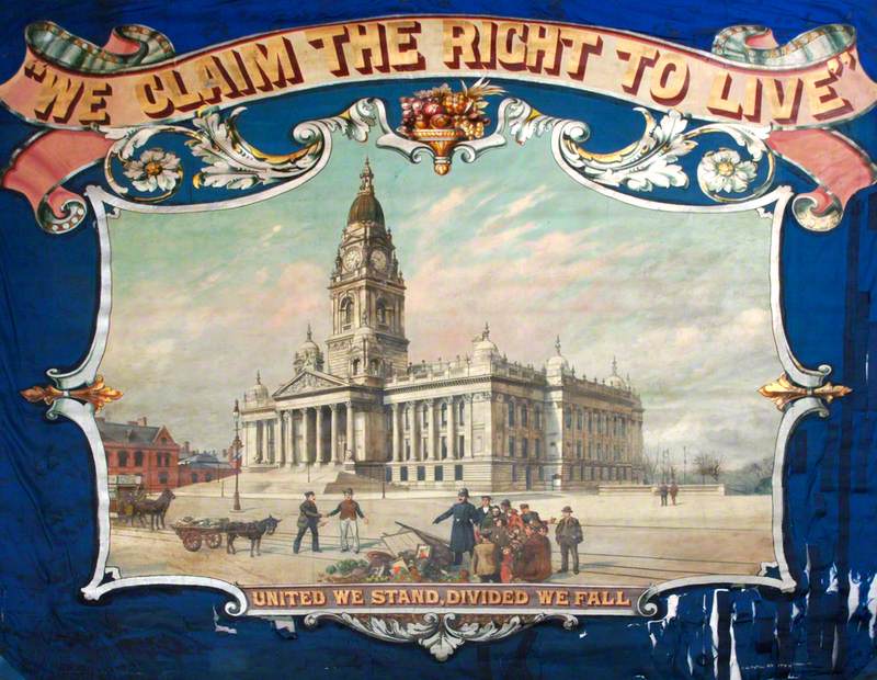
In the last half of the nineteenth century, one workshop gained an almost total monopoly on the production of trade union banners: George Tutill's of City Road, London. From 1837 until the factory's destruction in the Blitz, the workshop produced around 75% of all banners in the UK.
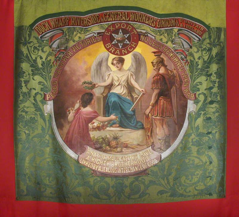
Tutill's banners typically follow a set pattern: a painted central medallion surrounded by woven foliage. This formula was multi-purpose – his catalogues advertise not only union banners, but banners for Sunday schools, churches and friendly societies. As such, the angel in the above banner for the Dockers' Union could have been derived from a design for a church banner.
In the late 1880s, a wave of more radical trade unions were formed by so-called unskilled workers. The young blood derided the older unions as 'coffin clubs', without the agenda or teeth to effect social change.
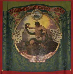
This banner was created by Tutill's workshop for the Dockers Union Export Branch in the 1890s, which was formed after the Great Dock Strike of 1889. The strike saw 130,000 dock workers walk out in protest of bitter exploitation. They achieved their main demand – a living wage.
The message on the banner is fierce: a bare-chested son of toil, taken to be Hercules, wrestles the snake of capitalism. He is flanked by slogans of socialism and war. The quote on the right – 'We will fight and may die, but we will never surrender' – is attributed to Lieutenant Vilian in the 1863 Battle of Camarón. On the left, 'An injury to one is an injury to all' is the motto of the Industrial Workers of the World.
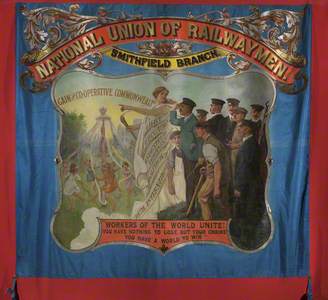
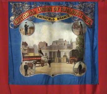
National Union of Railwaymen Smithfield Branch Banner
(recto) c.1925
unknown artist 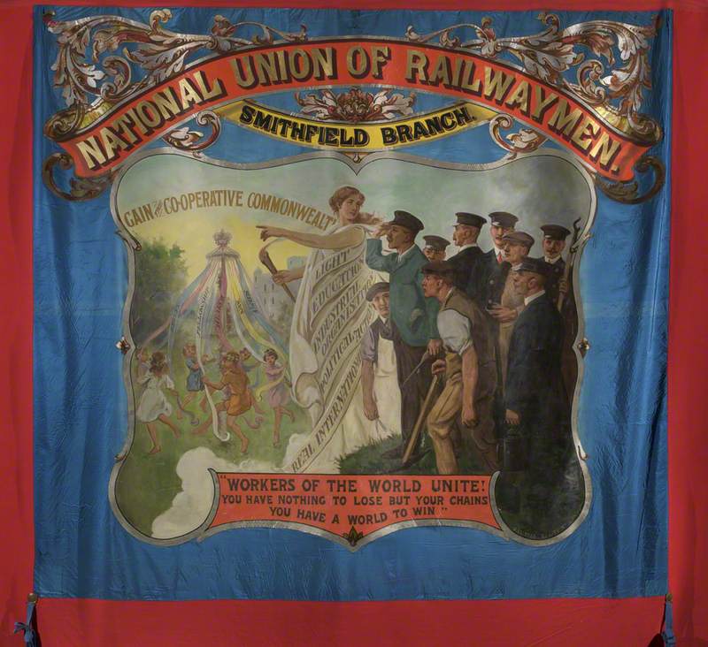
The romantic banner style of Tutill's workshop prevailed into the twentieth century. This hopeful example, commissioned by the National Union of Railwaymen c.1925, shows a classical figure gesturing towards a sun-soaked land of 'cooperative commonwealth'. Workers peer through pollution to witness the promised land, where children dance around a maypole. This is a vision of a mythologised medieval past when ordinary people had a fair share of life's blessings, including, as the maypole ribbons proclaim, fellowship, art and science. The scene sits atop some lines from Karl Marx's Communist Manifesto.
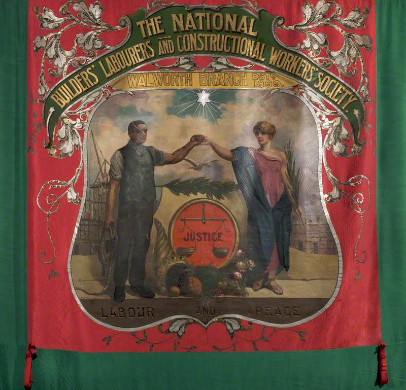
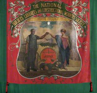
National Builders Labourers And Construction Workers Society Banner
(recto) c.1921
unknown artist 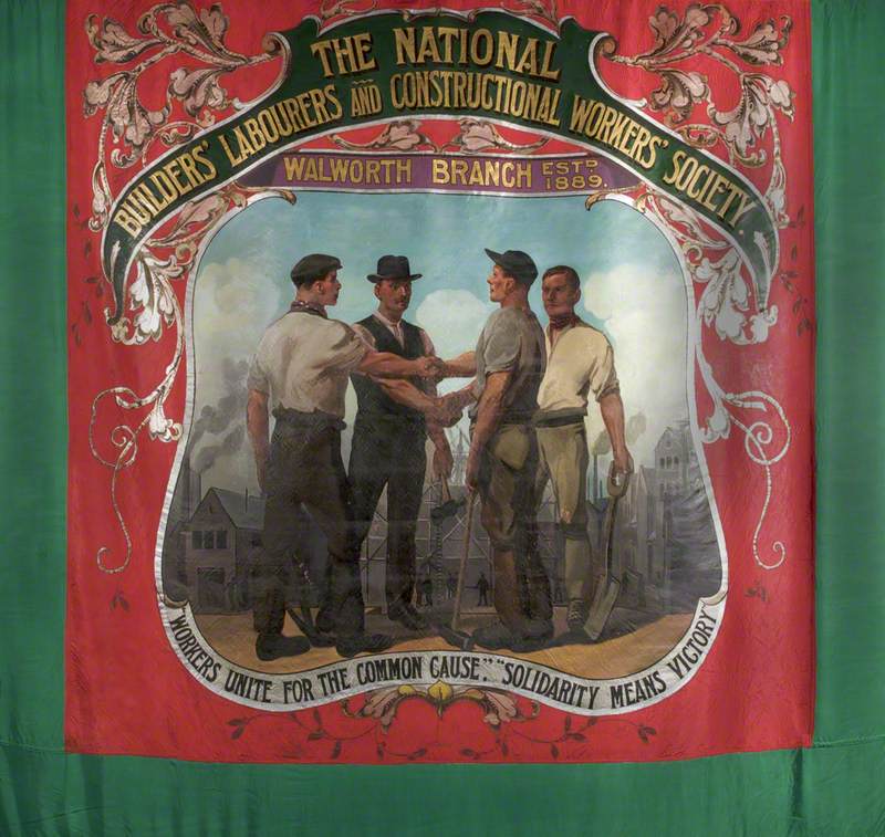
Compared to earlier examples, Tutill's banners are compositionally simple. Whilst they retained the convention of referencing classical mythology and presenting text on scrolls, some also reflected the union's expanded aims – to help fight for a fairer future.
Trade union banners recall a tradition of popular pageantry that cemented community identity and bonds. From the days when unions held midnight meetings on dark moors to those of dedicated union halls, successive generations of banners were wound with a common thread. These were visual proclamations that colleagues planned to take care of one other – and through unity, had the strength to take care of you, too.
Miranda Gabbott, writer
Further reading
John Gorman, Banner Bright, Scorpion Cavendish Ltd, 1986
Anne Ravenhill-Johnson, Art and Ideology of the Trade Union Emblem, 1850–1925, Anthem Press, 2013
Paula James, 'Protest Banners: Trade Union', Open Learn, 2018
